Preface by jan middendorp
Each new technology emulates preceding ones; only after a period of habituation it manages to detach itself from the past. The first printed books tried to look like manuscripts; the earliest films were pictures that moved; television in its early days looked like a radio show with an image. Digital typography also had some trouble finding its own voice. Even today, the beauty and directness of books and posters set in metal and wood type has remained a yardstick for what constitutes superior, functional printed matter. But there is interesting news: The development of typesetting and printing has turned into a snake that bites its own tail — Ourobouros.
When designers realized, around 1990, that font editor software allowed them to melt any alphabet from the past into a digital tool, wood type became part of the antiquity shop that type designers had
at their disposal. Some made it into neatly drawn display fonts (Adobe Wood Type); others imitated the weathered look of worn down type (FF Kipp). And some published new families such as FF Zapata, which appropriated stylistic elements of old display letters in order to create something personal and new that quoted the 19th century with a mixture of irony and nostalgia.
As young creatives gradually became one with their screen (small at first, than huge, than smaller and smaller again) some discontent began to be felt. Are we really supposed to do everything digitally?
Are my hands only good for operating a keyboard, a mouse, a pen and tablet, a touchscreen? Is software always the shortest route to the most interesting and effective outcome? Is it actually possible to create great and impressive things on a laptop? And so a counter-movement was born, a growing section of designers that began investigating how seductive, yet shallow digital worlds can be given more depth using analog means. Not unlike other disciplines (film, building, music) graphic design began dusting off half-forgotten techniques to deploy them with newly found energy — not with the aim to recycle traditional formal principles, but to cross old media and new visual ideas; to experiment with the coupling of digital to analog technology. Techniques in graphic design and typography that had long been considered hopelessly outdated — handlettering, calligraphy, letterpress — were revalued and are embraced by even more designers as a learning tool, an enrichment of the working process, a way to develop a new idiom through self-chosen limitations.
Wood type, not exactly a high point in typographic development in the eyes of academic typographers, took a special role in that revaluation process. Short copy, high impact, vigorous lettershapes: sure, letterpress posters are a bit of a quick’n’dirty job, but they are also a place for experimentation with form and color. In 2009 Justine Nagan’s movie 'Typeface' showed how a new generation of digital designers is becoming hooked to the type cases and presses of the Hamilton Wood Type and Printing Museum in Two Rivers, Wisconsin, USA.
For type designers, too, the relationship with wood type was one of users. The huge arsenal of mostly anonymous wood type designs became an inspiration and a free supplier of ideas to dozens of type designers who feel more comfortable reproducing or updating the past than inventing their own letterforms.
But the tide is turning! More precisely, the process is being reversed. Digitally designed fonts are now sometimes converted into three-dimensional, tangible printing type. This can be done by producing them as metal type, but you need a fully equipped foundry for that. It seems to be somewhat simpler and more small-scale to use wood or plastic. There are newly built bridges between the analog and the digital to help out.
But what is it good for, this return to letterpress? The answer is relatively simple: the combination of digital design and offset printing is simply too precise. Too sterile and flat. The third dimension is missing. Of course it is possible to take type and illustration into Illustrator or Photoshop and give them a worn surface or a rough edge; but that is just as artificial as the transformation of a razor-sharp digital picture into something fuzzy from days of old by clicking an Instagram filter. It sure has something, but no soul. To see one’s own letterforms really come alive, with real depth, overlapping colors, and a subtle imperfection that is both unpredictable and soulful, analog printing is a very nice tool indeed.
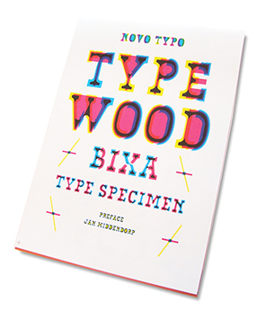
This publication introduces Typewood, the latest project from Novo Typo's Mark van Wageningen.
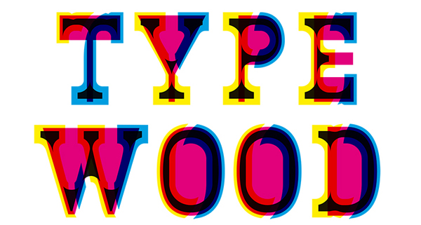
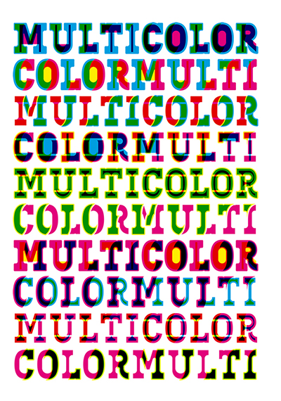
It’s centred around the BIXA typeface family, originally developed as a multi-colored web font — and therefore made to exist within a digital, virtual world only. But it was in wood type that the original multi-colored (in jargon: chromatic) fonts were first found. Printing shops in the 19th century used wooden letters with a shadow, a 3D effect or an inline in a second and sometimes third color for special effects in theater and circus posters. The idea to try out digitally designed contemporary chromatic types in letterpress printing seems a very logical (albeit adventurous) step.
Van Wageningen’s wooden font is not an isolated experiment. Some of Erik Spiekermann's best known digital typefaces were produced as wooden fonts about ten years ago. Recently Spiekermann created an alphabet of bold capitals for the Hamilton Wood Type and Printing Museum; only later it was produced as a digital face under the name HWT Artz. Type designer James Grieshaber made his HWT Geometric for the same client, and Matthew Carter drew HWT Van Lanen. Recently van Wageningen’s fellow Dutchmen Pieter van Rosmalen of the Bold Monday digital foundry and his colleague Jacques Le Bailly embarked on a wood type project adapting the blackest (‘Monster’) version of the Nitti Grotesk family into Nitti Monster Wood.
Typewood BIXA does something that none of these other contemporary billboard faces do: it allows for building a multi-colored text from loose letterparts printed in separate runs — a bit like Cassandre’s 1929 Bifur, or the modular construction kits from the late Art Deco era: Fregio Mecano (Italy) and Supertipo Veloz (Spain). I’m sure that this technique offers a wealth of possibilities, and that the work shown in this publication is only the tip of a tasty iceberg. I am curious to see what else Novo Typo has in store.
Jan Middendorp, Faenza, june 2015